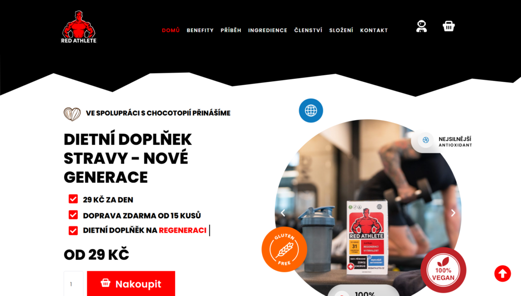
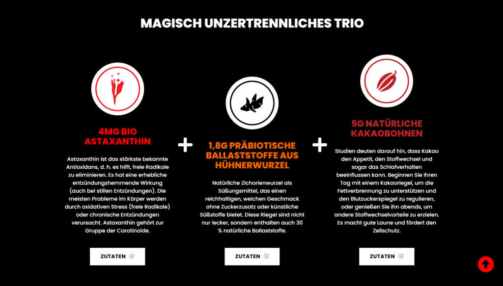
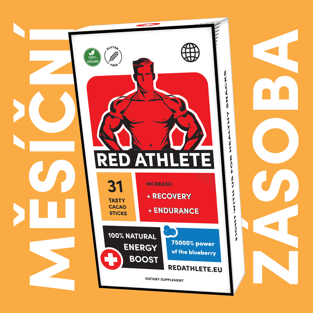
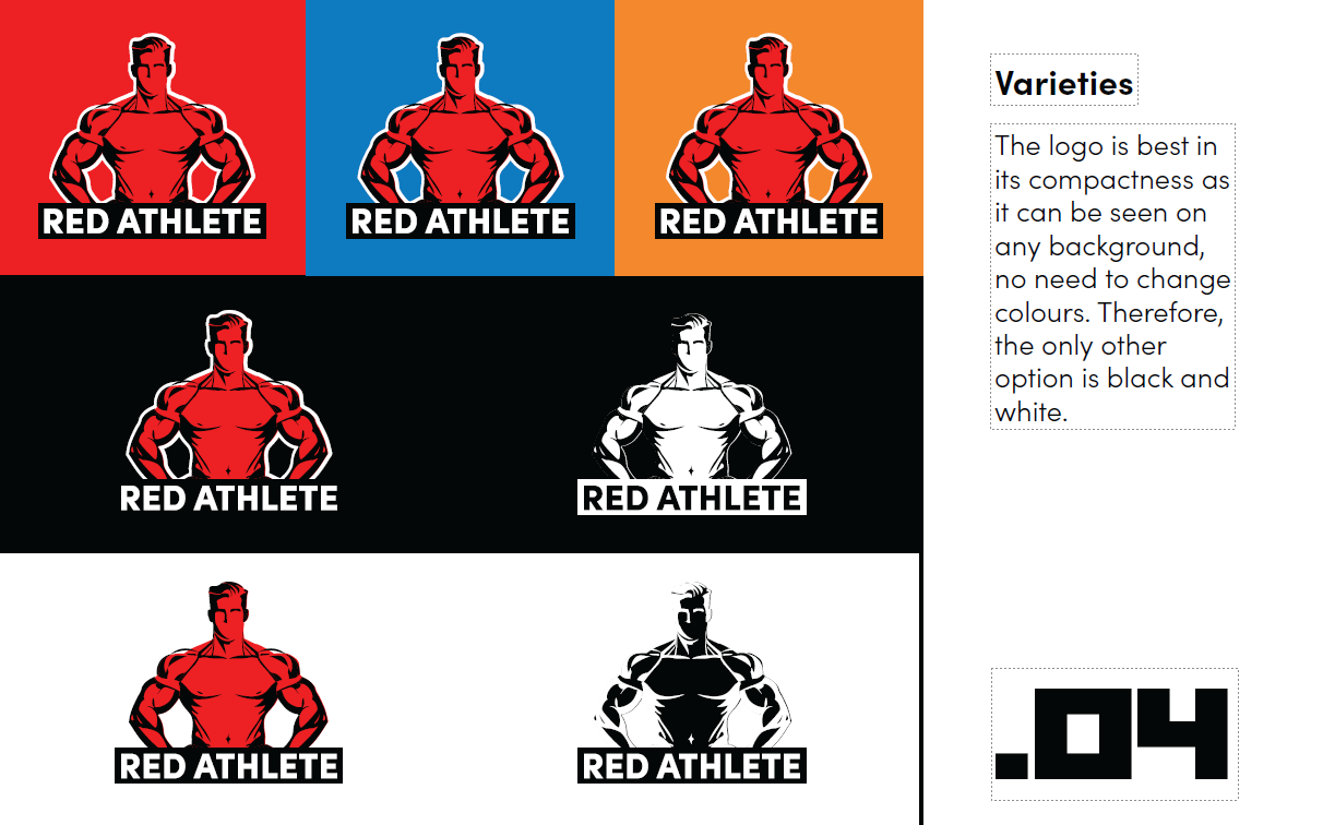
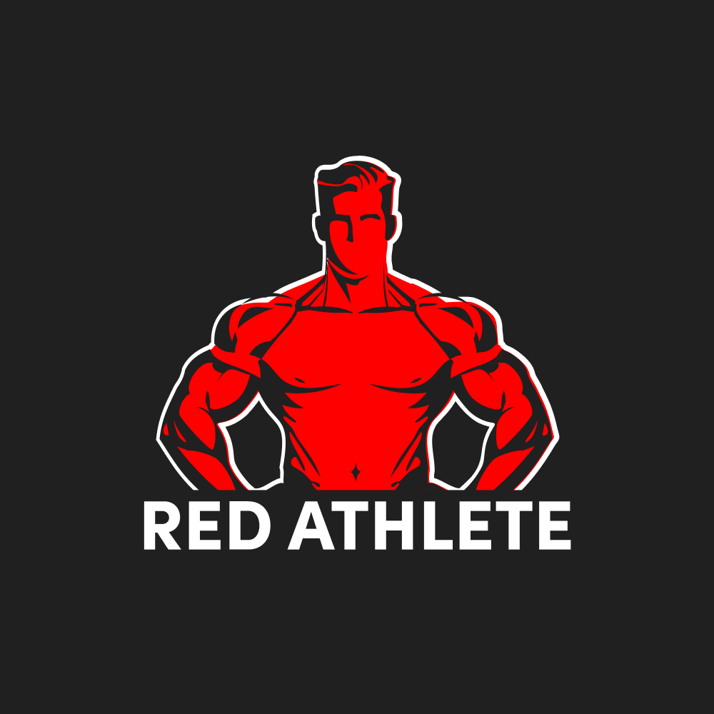
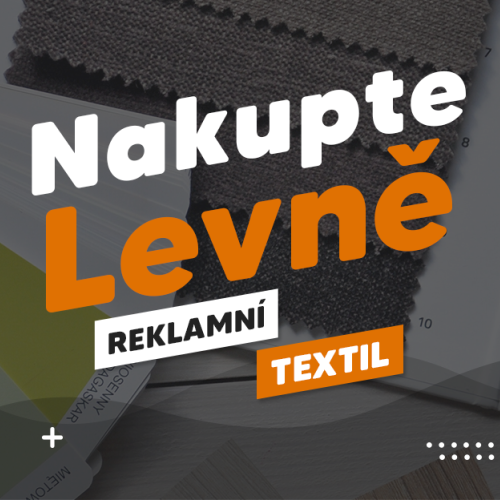
We created a “modern comics” visual identity for the Red Athlete e-shop, focused on sports regeneration and strength recovery product. The design is bold, modern, and dynamic, reflecting the energy, power, and intensity athletes need to recover faster and perform at their peak.
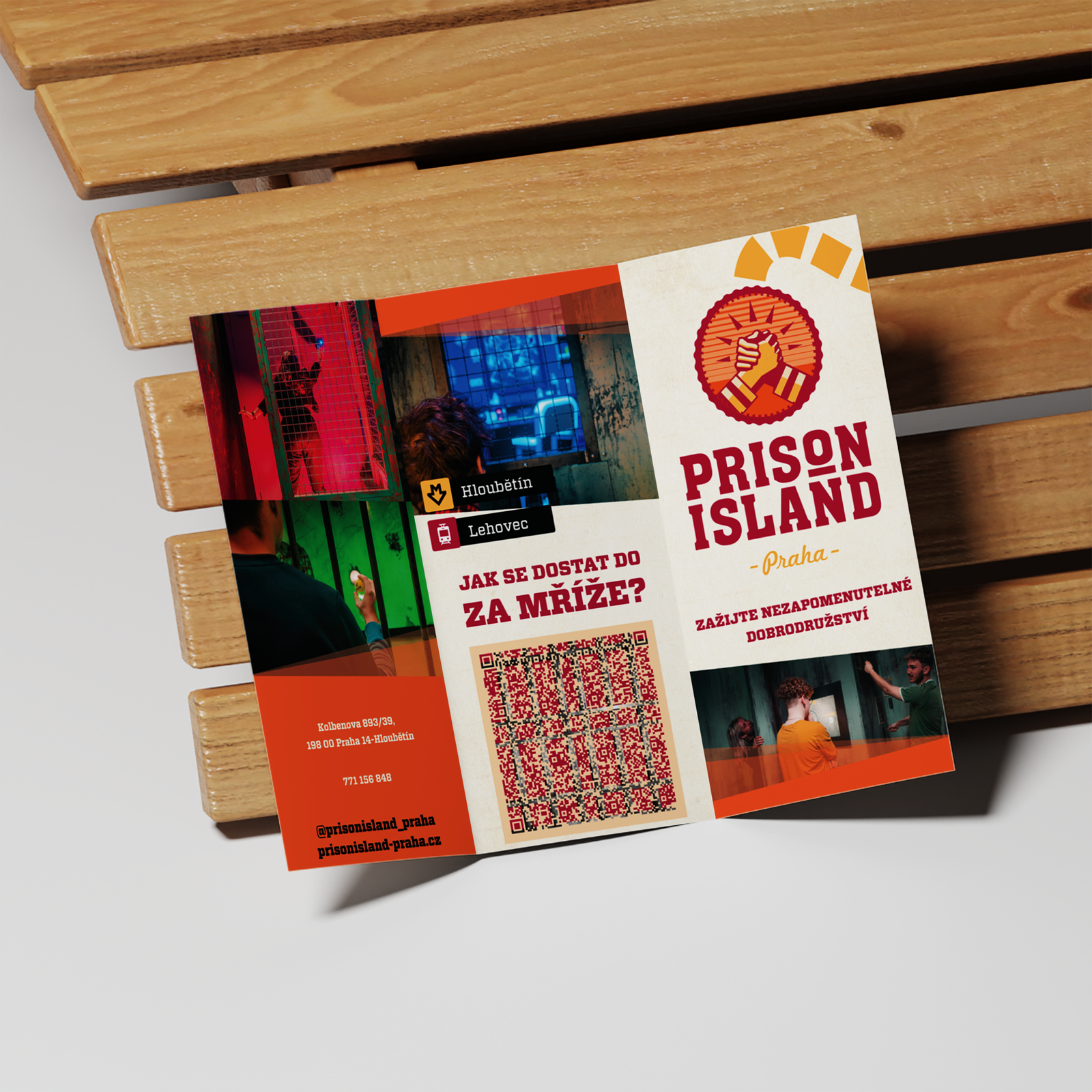
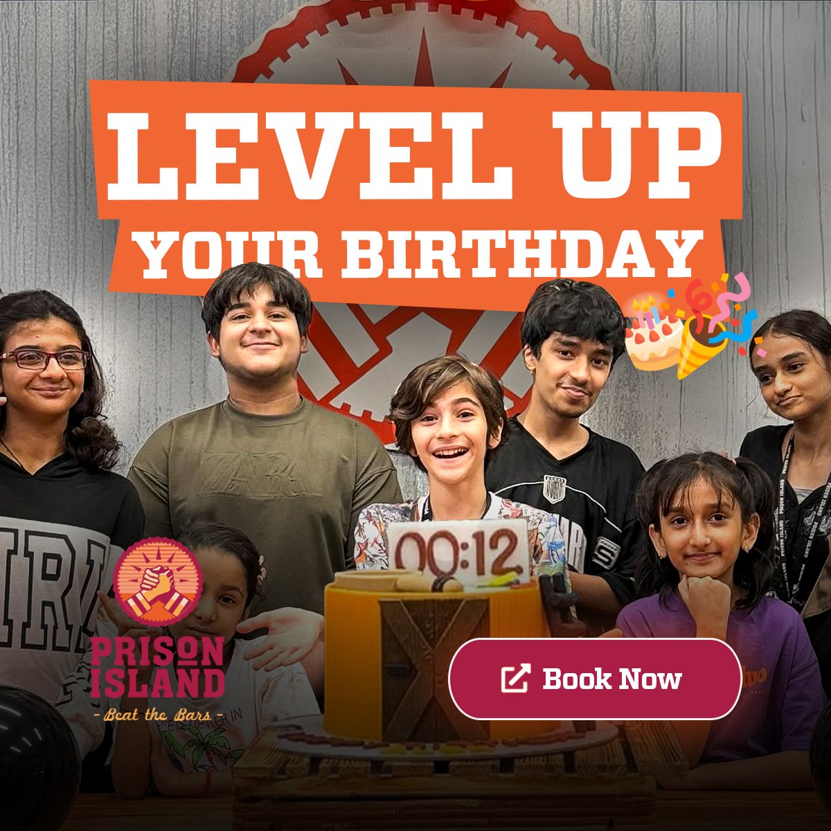
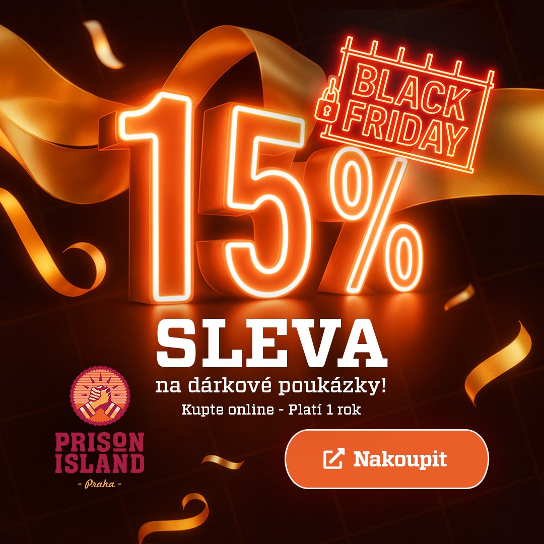
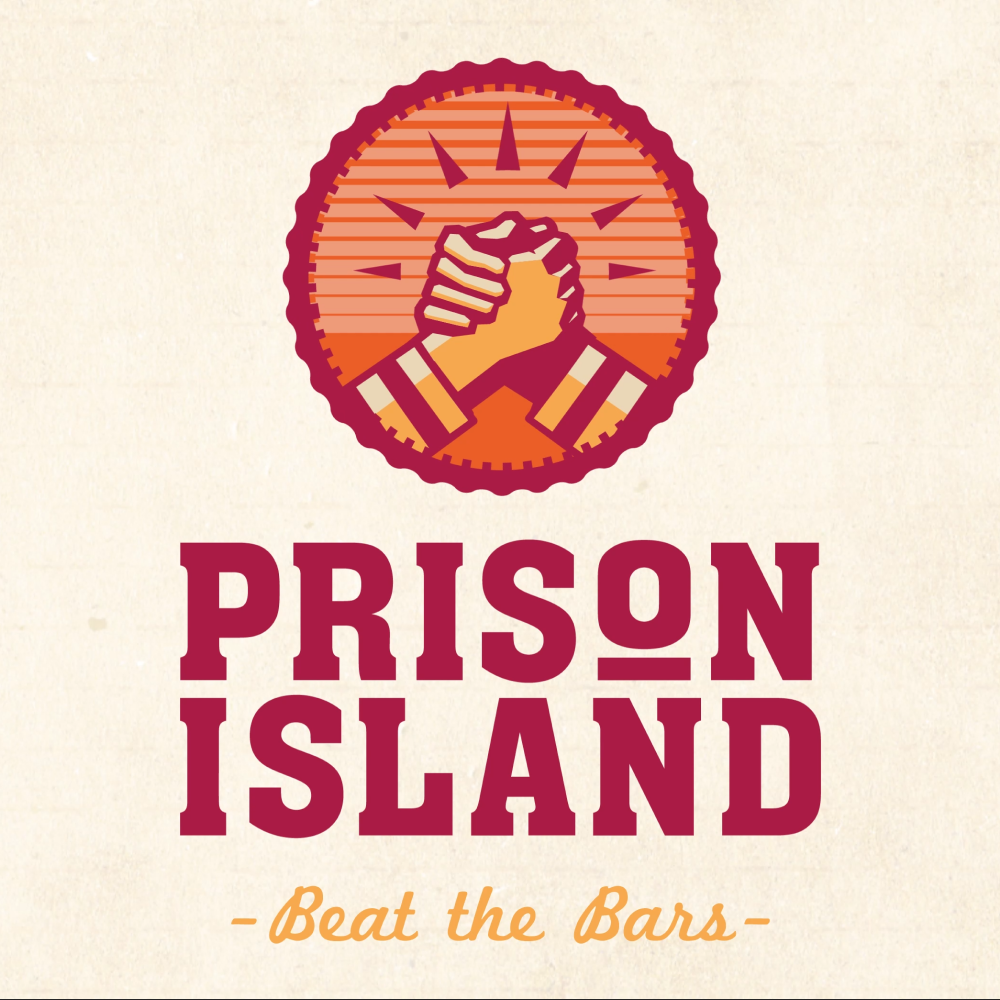
We redesigned and launched a new website for Prison Island Praha, elevating the brand’s digital presence and clearly translating its experiential concept into a modern, high-impact online experience.
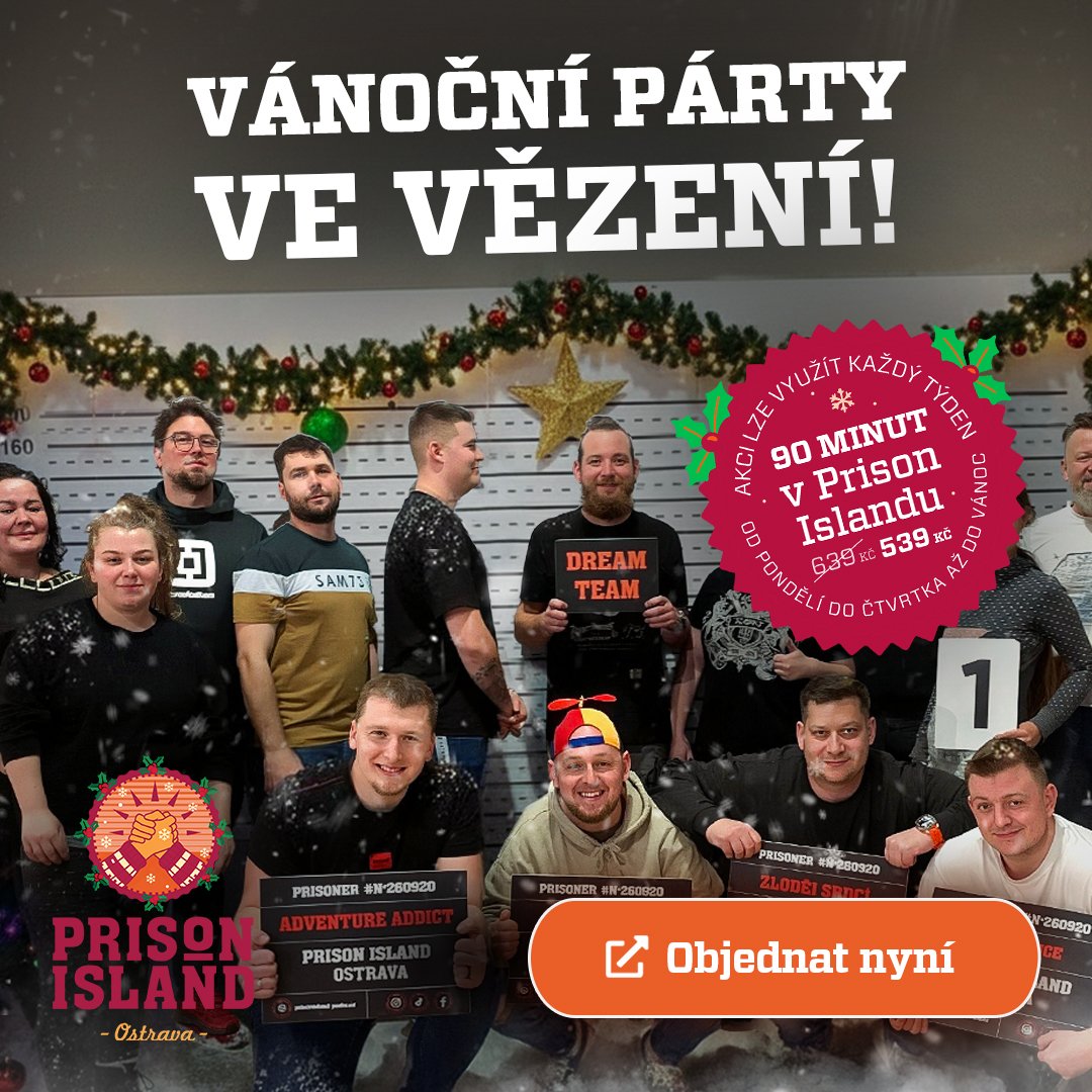
The project was highly successful – both visually and performance-wise which led to further collaboration. As a result of this success, we were entrusted by other Prison Island locations, including Ostrava and UAE.
Across all markets, we delivered consistent, modern websites tailored to each location, helping unify the brand while driving strong results locally. This expansion confirmed the strength of our approach and our ability to scale high-quality digital experiences internationally.
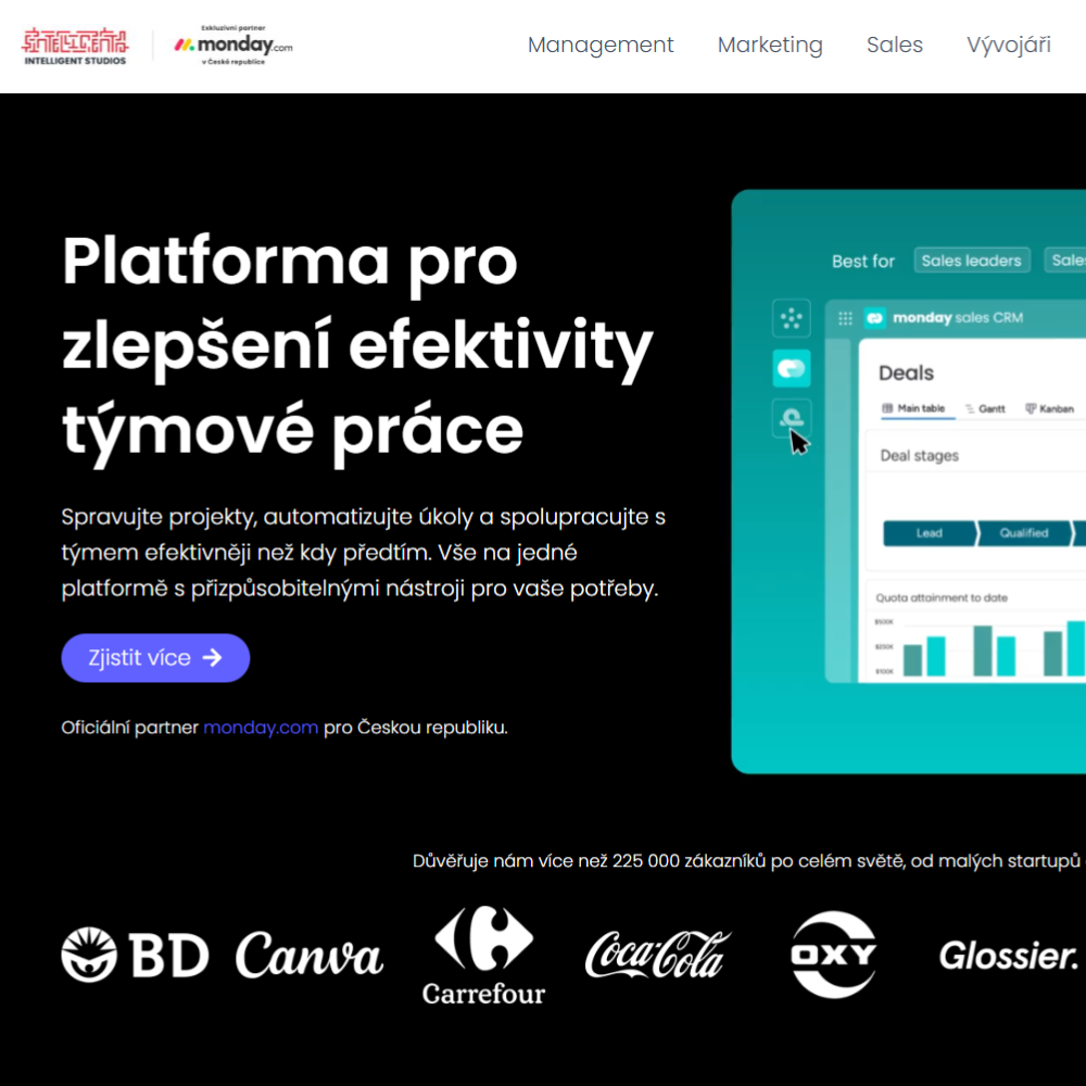
We designed and delivered localized websites for monday.com in the Czech and Polish markets.
Each website was tailored to its local audience, focusing on clear value propositions, localized messaging, and conversion-driven structure to support lead generation and onboarding. The result was a consistent brand experience across markets, adapted to local needs while maintaining monday.com’s global identity.
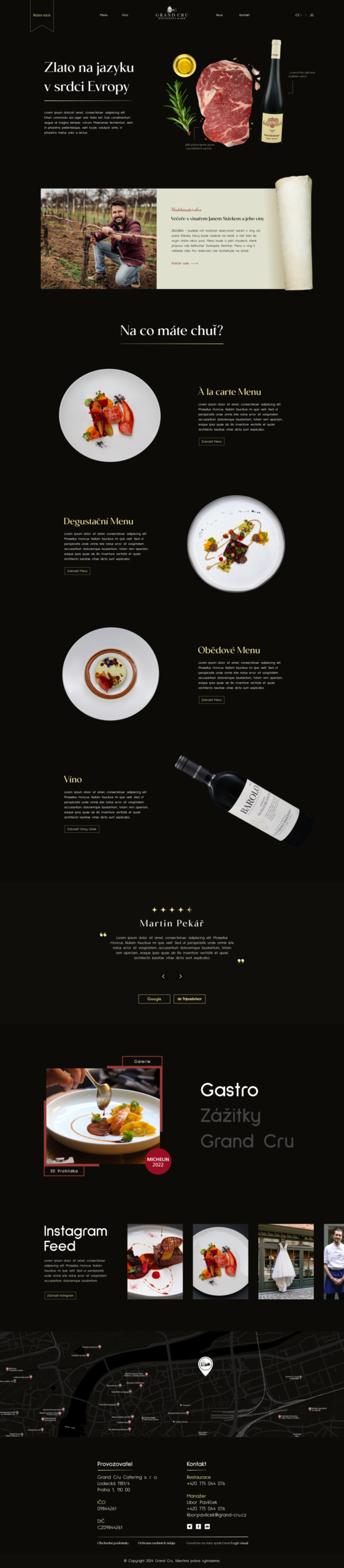
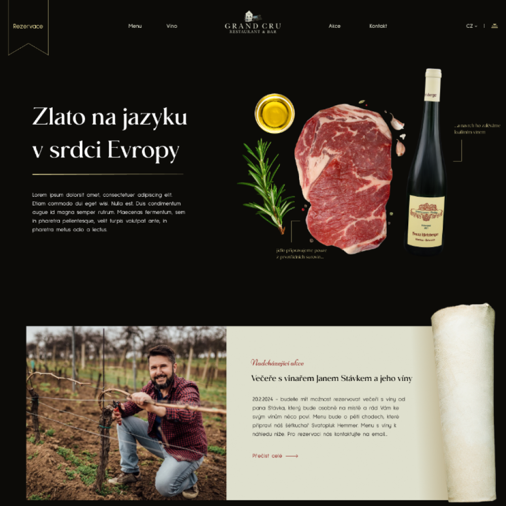
We designed a website concept for Grand Cru with a strong emphasis on a premium visual identity and parallax effects that enhance the fine-dining atmosphere.
The website combines elegant typography, bold photography, and smooth animations to create a modern yet understated sense of luxury. The goal was to deliver an online experience that fully aligns with the character of the restaurant and reflects the sophistication of the dining experience itself.
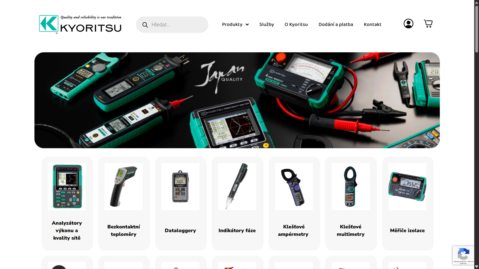
We designed an e-commerce website for Kyoritsu, focused on professional measuring equipment. The design is clean, clear, and highly functional, with strong emphasis on easy navigation through the product range and technical specifications.
The goal was to create a user-friendly environment that reinforces the brand’s credibility while making the purchasing process straightforward for both professional technicians and general customers.
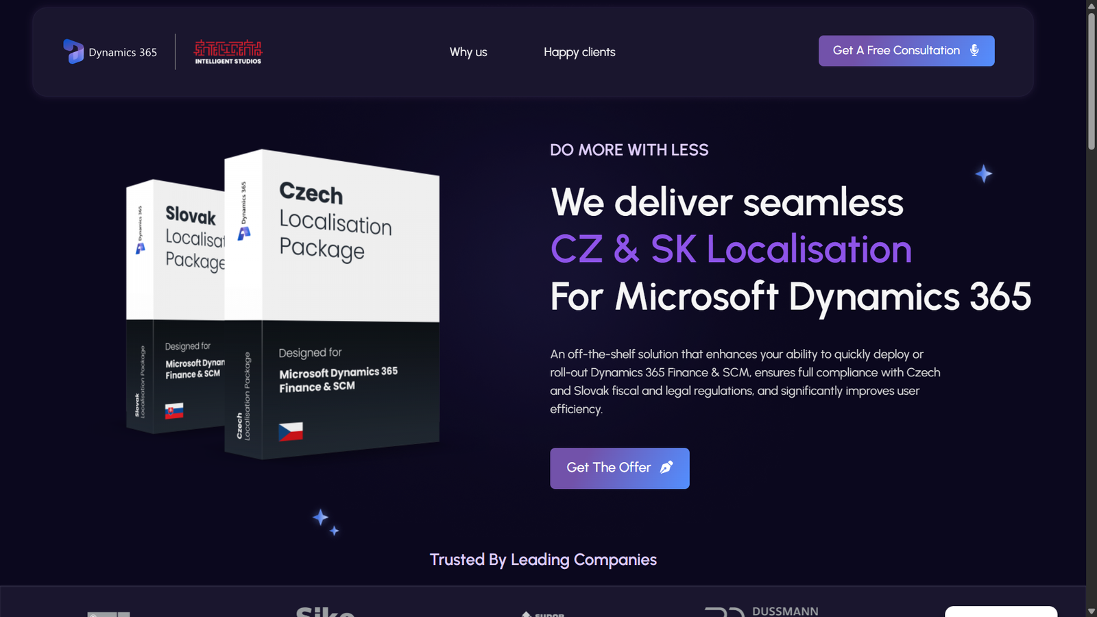
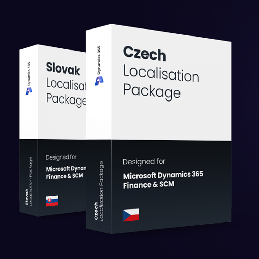
We designed a localized landing page for Dynamics, tailored specifically for the Czech and Slovak markets.
The goal was to create a modern, clear, and well-structured website that reflects the brand’s technical focus while making the content easy to understand for local audiences. The design is built on clean lines, functional layouts, and a professional visual style that strengthens brand credibility across both markets.
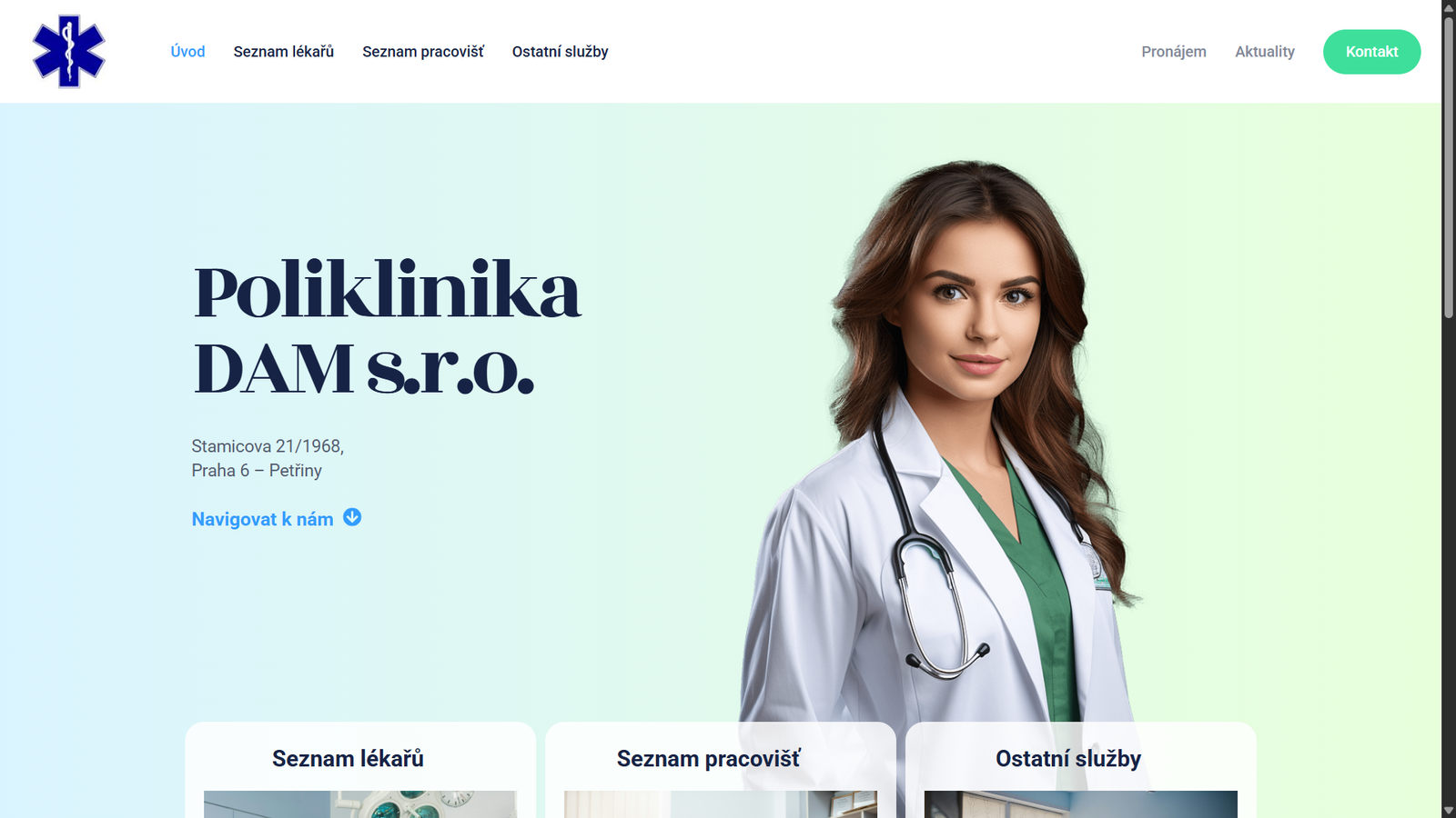
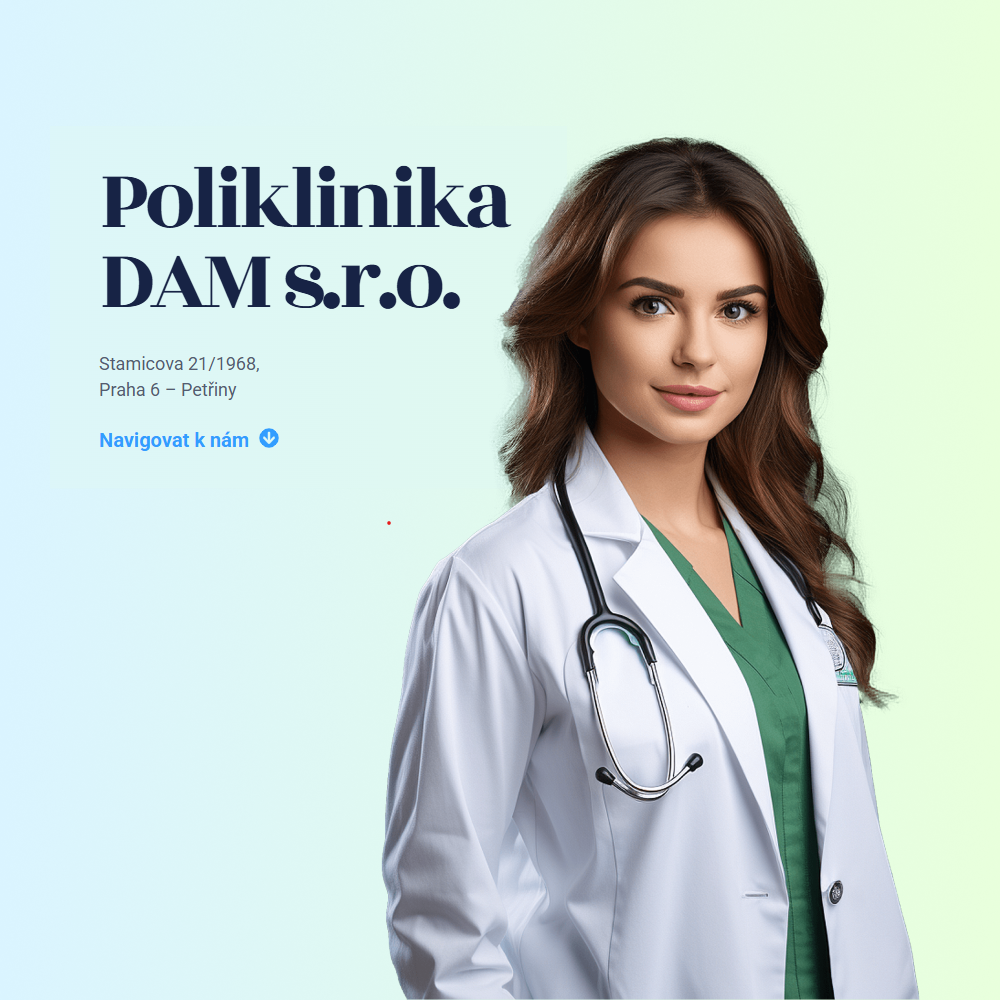
We designed and delivered the complete website for Poliklinika DAM, including a custom administrative system.
The project covered both the public-facing website and the backend, enabling efficient content management and smooth day-to-day operations for the clinic’s team. The result is a modern, clear, and user-friendly digital platform that supports patients while giving the client full control over their content and workflows.
We create a landing page for Geronimo that reflects the agency’s creative and marketing-driven DNA.
The design combines playful graphic elements, bold typography, and smooth animations to support a fresh, confident, and dynamic visual style. The goal was to create a website that clearly presents their services while engaging visitors through a diverse and visually striking portfolio of work.
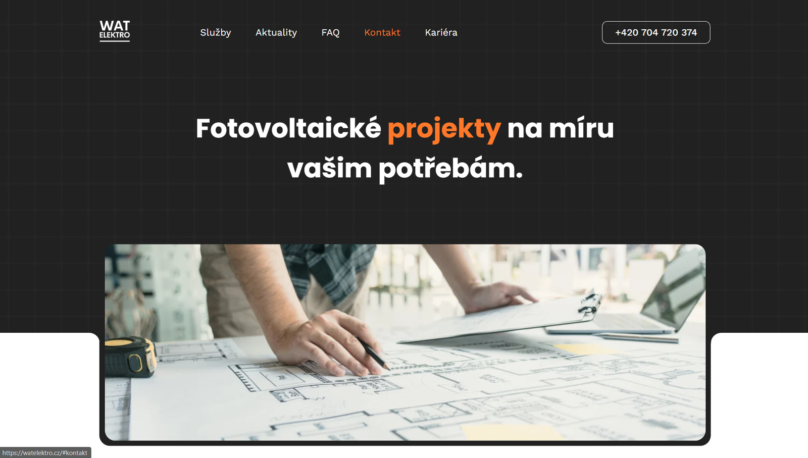
We designed a website for WAT Elektro with a strong focus on clear service presentation and easy content management.
The solution includes a simple system for adding blog posts, allowing the company to regularly publish news, practical advice, and technical tips for its customers. The website design is clean, functional, and built around a technical visual style that aligns with the brand’s field of expertise.
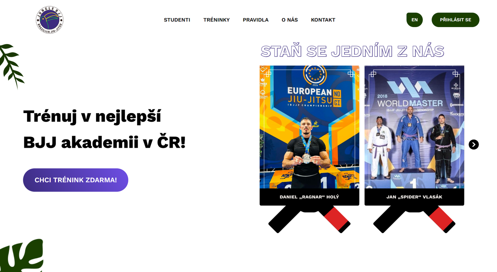
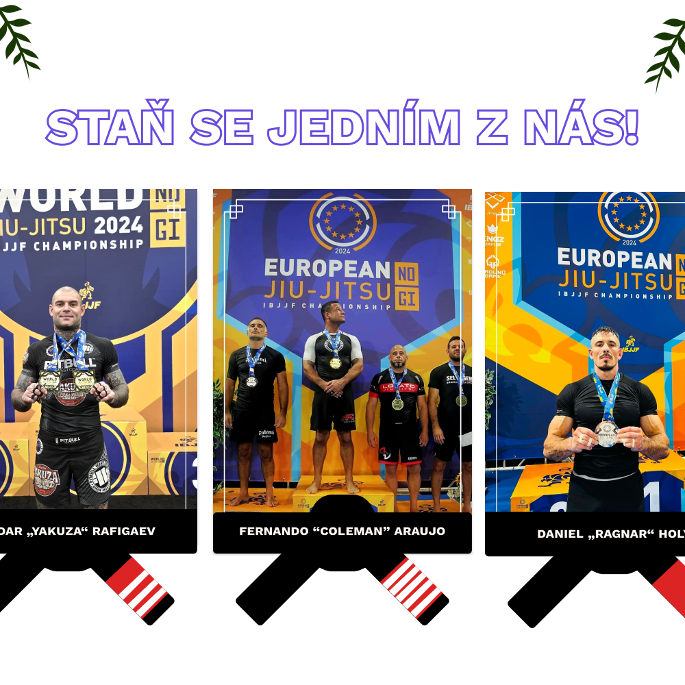
We designed and delivered a landing page for Jungle BJJ Beginners with a clear focus on accessibility, motivation, and first-time visitors.
The website was built to speak directly to beginners in Brazilian jiu-jitsu, using an approachable structure, friendly messaging, and an energetic visual style. The goal was to create a welcoming online experience that lowers the barrier to entry and encourages people to take their first step into the world of combat sports.
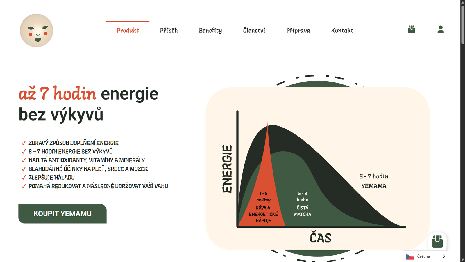
We designed and delivered a website for Yemama with a strong focus on clarity, usability, and a gentle, modern visual style.
The website was created to reflect the brand’s authenticity and its focus on carefully selected products for children and parents. Our goal was to build a warm, trustworthy, and easy-to-navigate online experience that supports both browsing and purchasing.
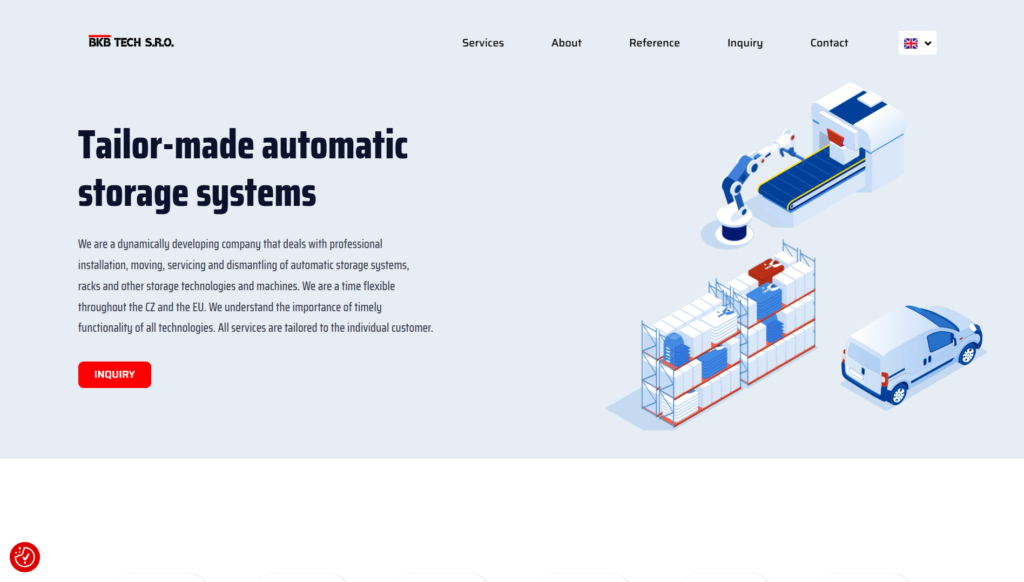
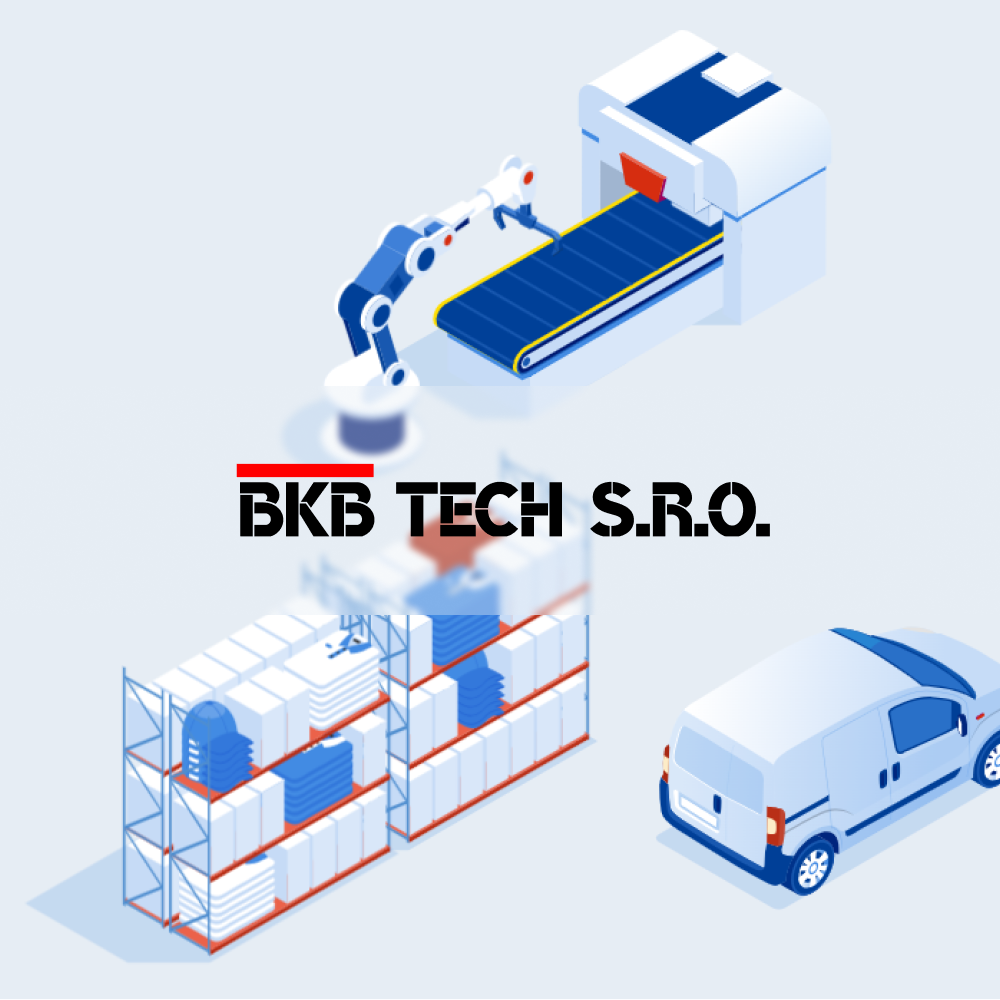
We designed a website concept and a set of custom animations for BKB Tech, supporting the brand’s technical focus and modern positioning.
The website is built on a clean, professional design with a strong emphasis on clear presentation of services and products. The animations were created to bring the content to life, highlight key information, and reinforce the company’s innovative approach within the technology and industrial solutions space.
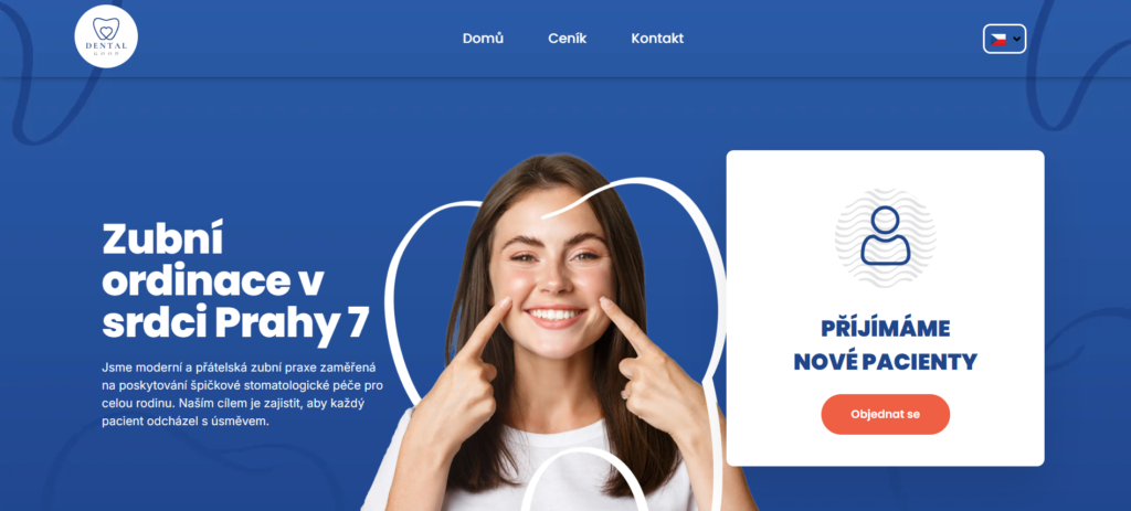
We developed a comprehensive visual identity for Dental Good, excluding the logo itself.
Our work included the design of the website, printed materials, presentation assets, and additional graphic elements. The goal was to create a modern, clean, and trustworthy visual style that supports the brand’s professional image in the field of dentistry and dental care.
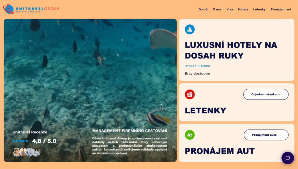
We designed and delivered the website for Unitravel Group, including a fully integrated booking system.
The project focused on clear structure, strong visual hierarchy, and an intuitive user experience, allowing users to easily explore destinations and complete reservations online. The result is a modern, trustworthy digital platform that supports both brand credibility and seamless booking for customers.
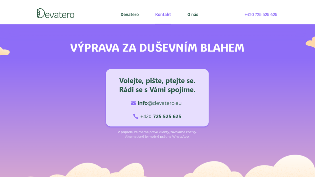
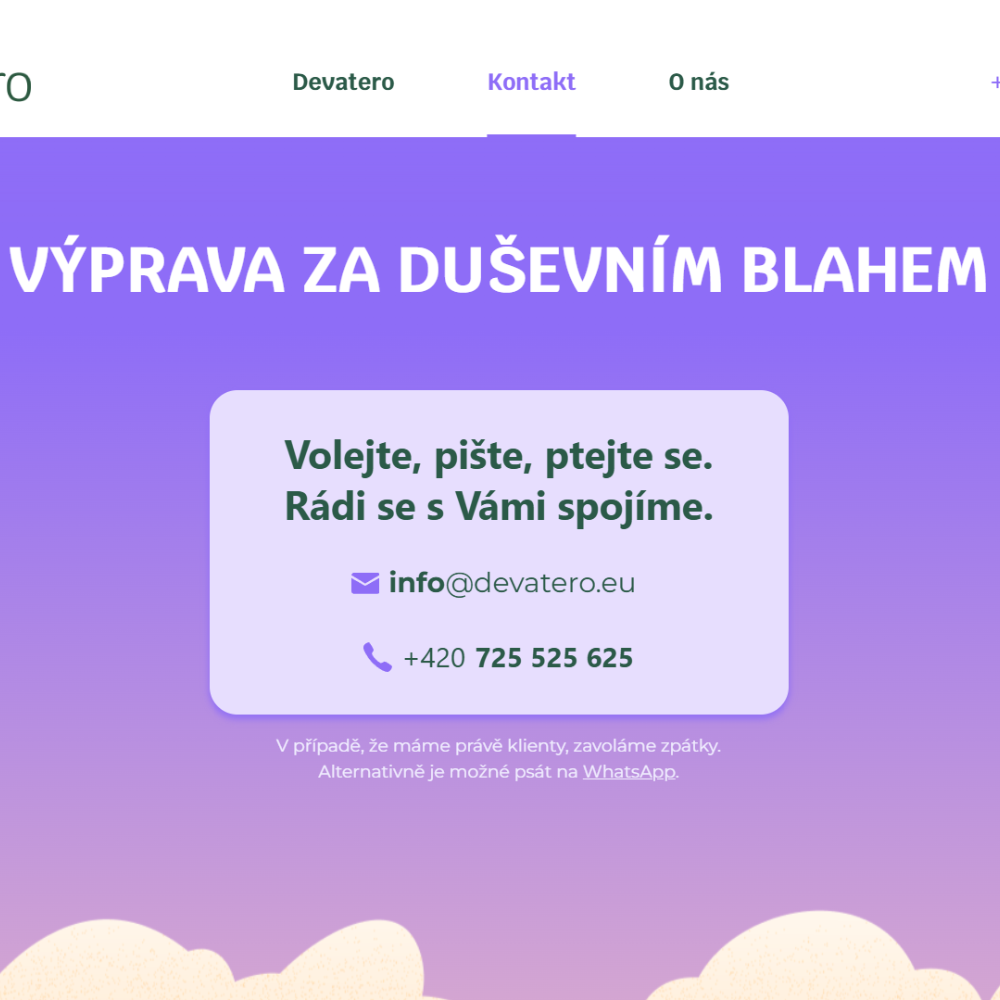
We designed and delivered a website for Devatero with a strong emphasis on a calm, therapeutic atmosphere.
The website uses subtle parallax effects, soft transitions, and a minimal visual style to create a sense of balance and ease. The goal was to build a peaceful online experience that supports trust, reflection, and emotional comfort, fully aligned with the brand’s therapeutic focus.
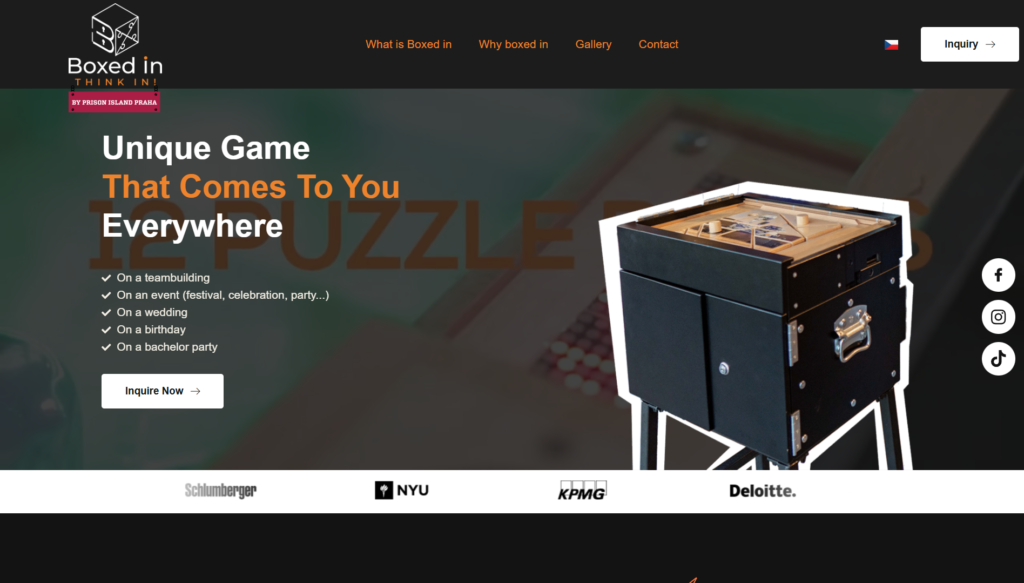
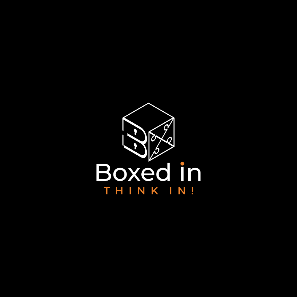
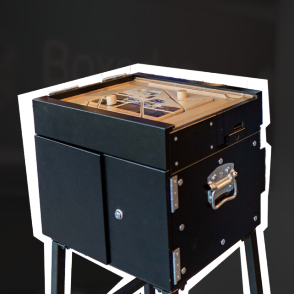
We designed and delivered a conversion-focused landing page for BoxedIn, built to clearly communicate the value of their mobile team-building experience.
The landing page focuses on strong messaging, clear service benefits, and a streamlined structure that guides visitors toward inquiry and booking. The design combines an energetic visual style with clarity and simplicity to support lead generation and campaign performance.
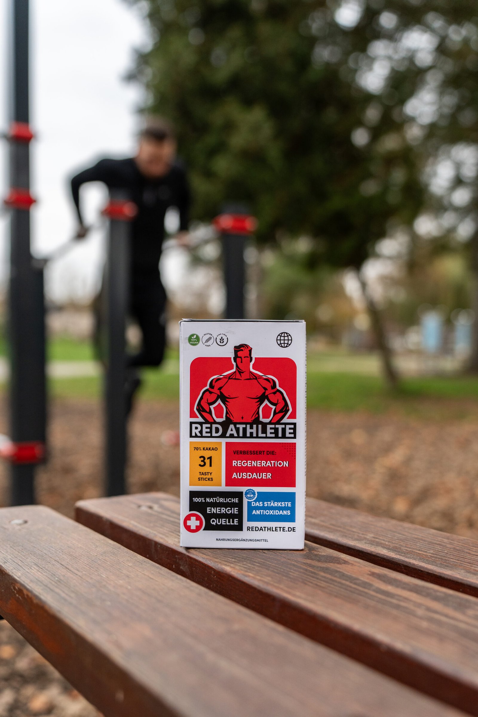
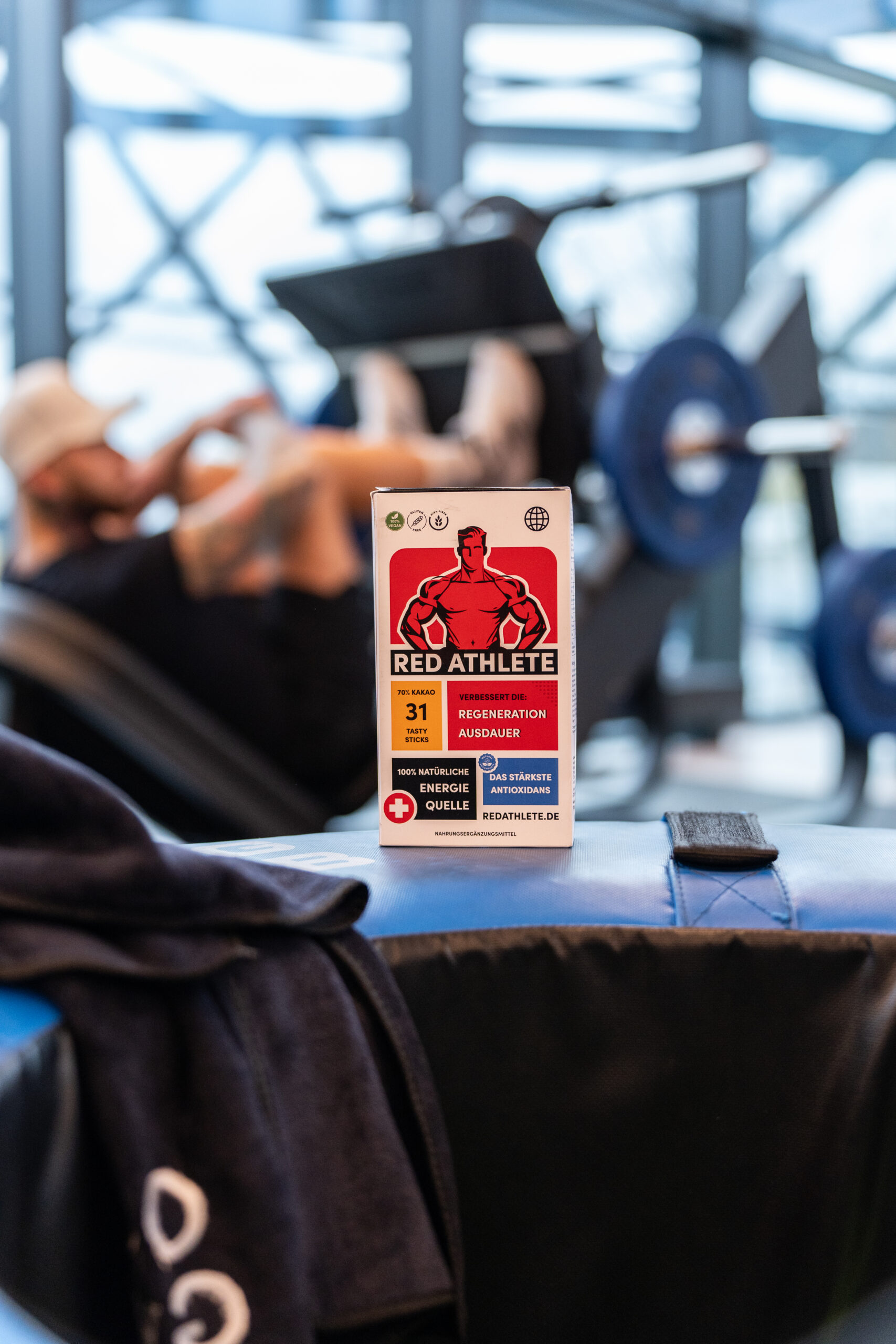
We built a “modern comics” visual identity and used it as the foundation for paid advertising and performance creatives for a sports recovery product.
The bold, dynamic design was crafted to stand out in ads, communicate energy instantly, and speak directly to athletes focused on regeneration and strength recovery. The goal was not just to look good, but to drive attention, engagement, and performance across paid channels.
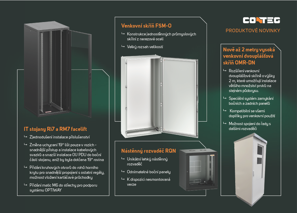
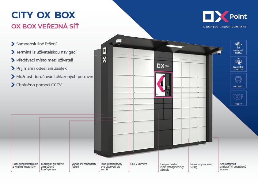
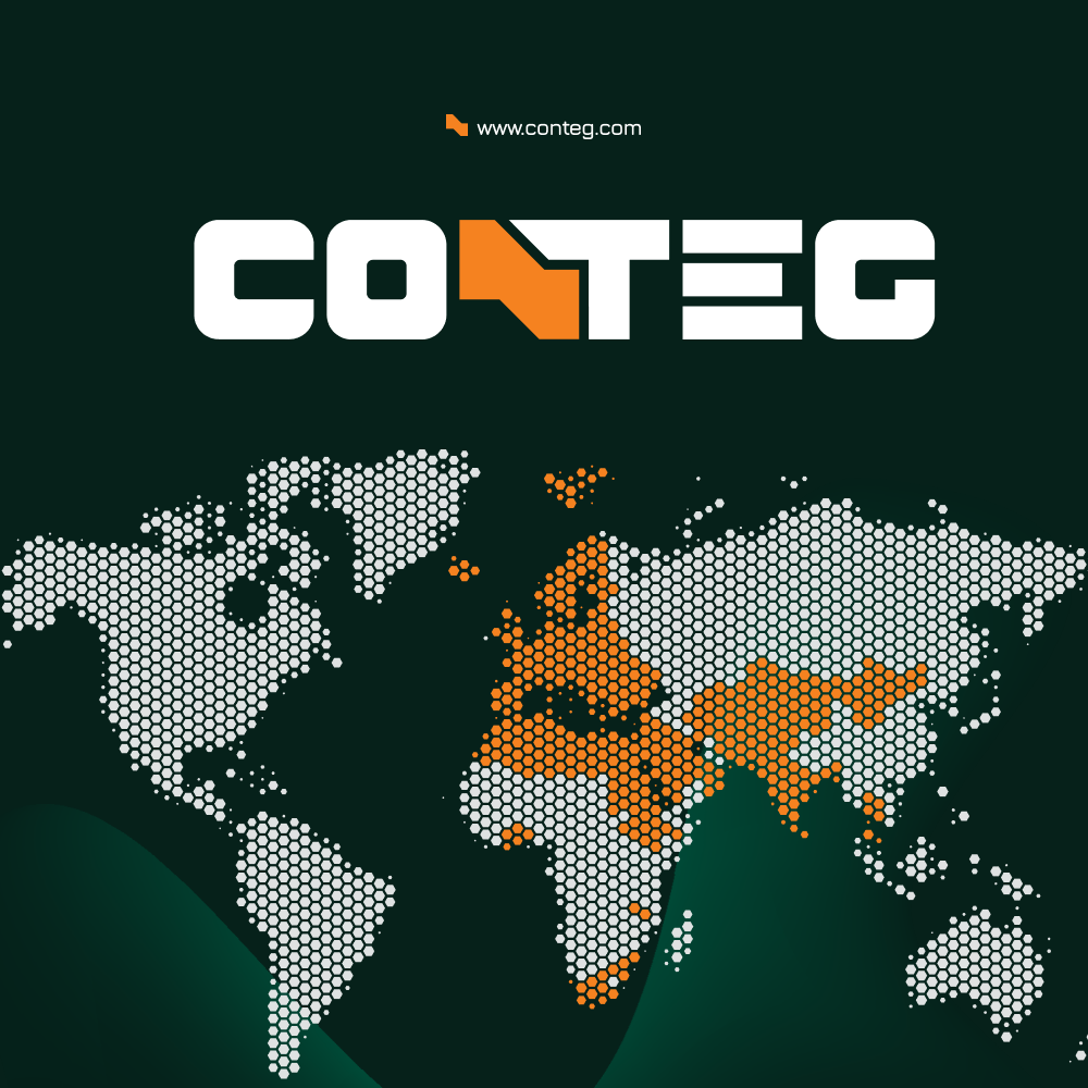
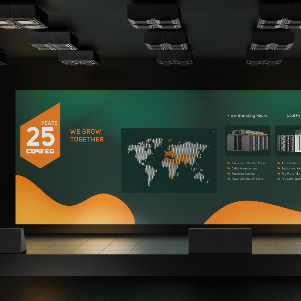
For Conteg Group, we supported the brand through a broad range of visual and creative materials as part of an ongoing graphic collaboration.
Our work focused primarily on print materials, datasheets, presentations, videos, animations, and supporting creative assets. The goal was to maintain a consistent visual language across all formats while making complex information clear, structured, and visually engaging for both business partners and end customers.
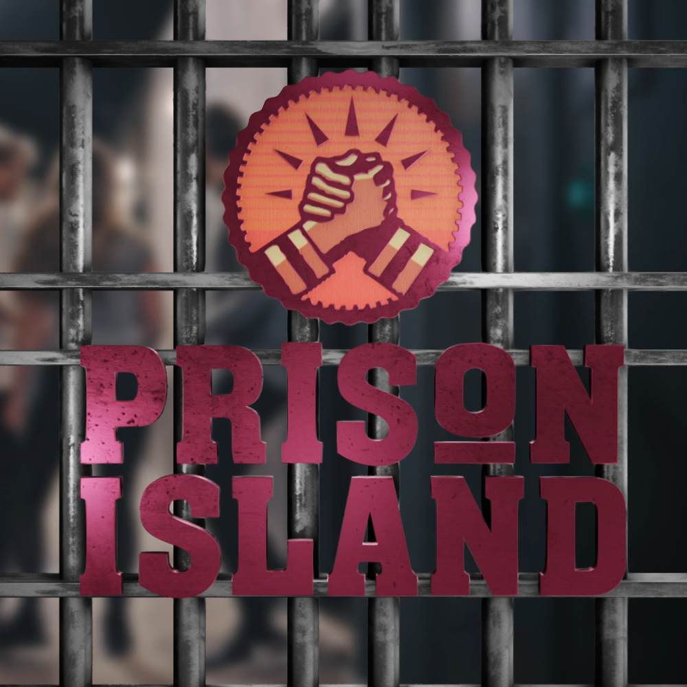
We helped Prison Island Praha grow through full-scale marketing from website and creatives to performance-driven execution.
The results spoke for themselves. Strong growth and performance led to us being trusted by other Prison Island locations, including Prison Island Ostrava and Prison Island UAE, where we now scale the brand consistently across markets.
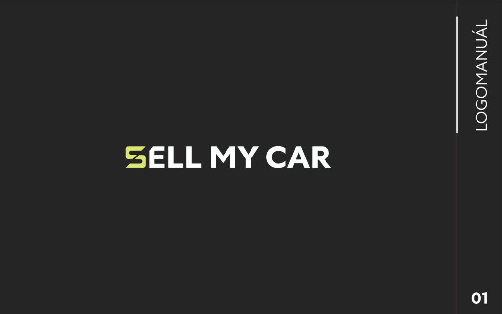
We designed a new logo for Sell My Car that reflects the brand’s simple and straightforward concept – fast, hassle-free car selling.
The logo is clean, modern, and easy to remember, built around bold typography and a minimalist symbol that reinforces a trustworthy and professional brand impression.
For Hardwario, we delivered full marketing support, combining strategy, creative production, and consistent brand execution across channels.
Our work covered everything from PPC campaigns and ad creatives to corporate presentations, printed materials, and seasonal communication. The goal was to support Hardwario’s growth with a clean, functional, and modern visual language that reflects the brand’s technical and innovative character – both online and offline.
For Raw Entertainment, we supported their team through our graphic membership, delivering custom web designs and logo concepts for their clients.
We focused on creating visually strong and functional solutions tailored to each brand, helping improve campaign performance and enabling Raw Entertainment’s clients to communicate their value more clearly in the online space.
Type: Performance design membership
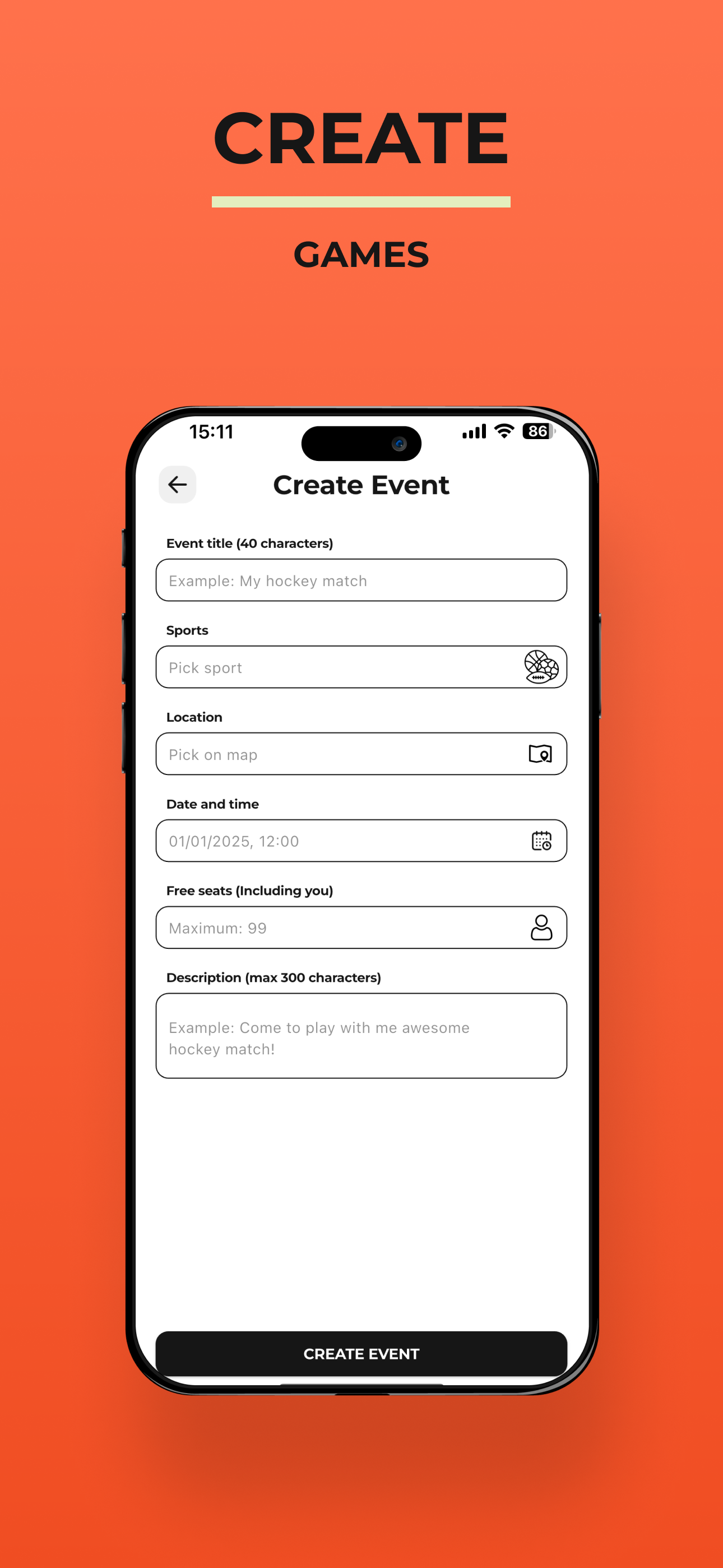
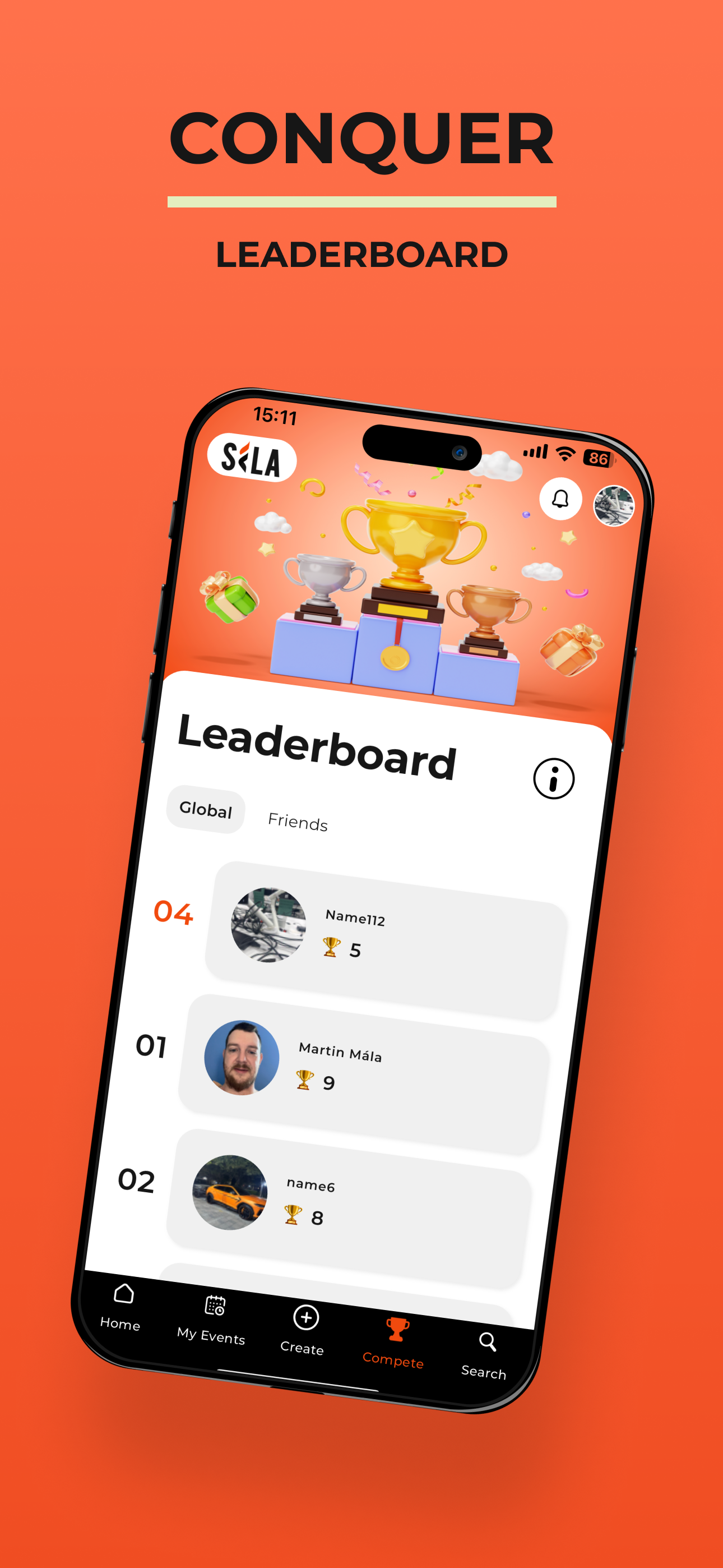
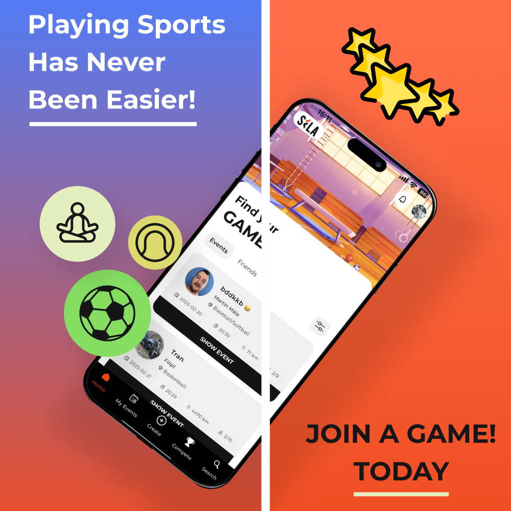
Sila
For Sila, we created the visual identity and a full set of graphic assets.
The goal was to build a modern, clean, and energetic visual style that supports the app’s community-driven nature and motivates users to perform, stay active, and share their sports achievements. Our work included the logo design, UI elements, and presentation materials, forming a cohesive visual system for the product.
Type: App development
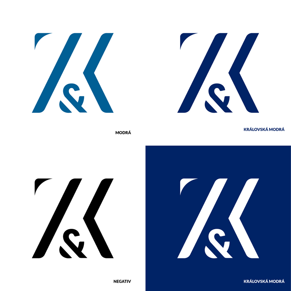
Zelenka & Kovanic
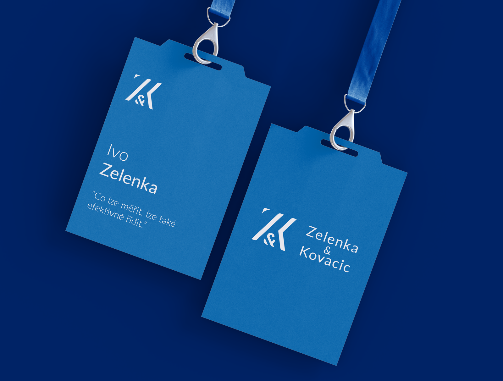
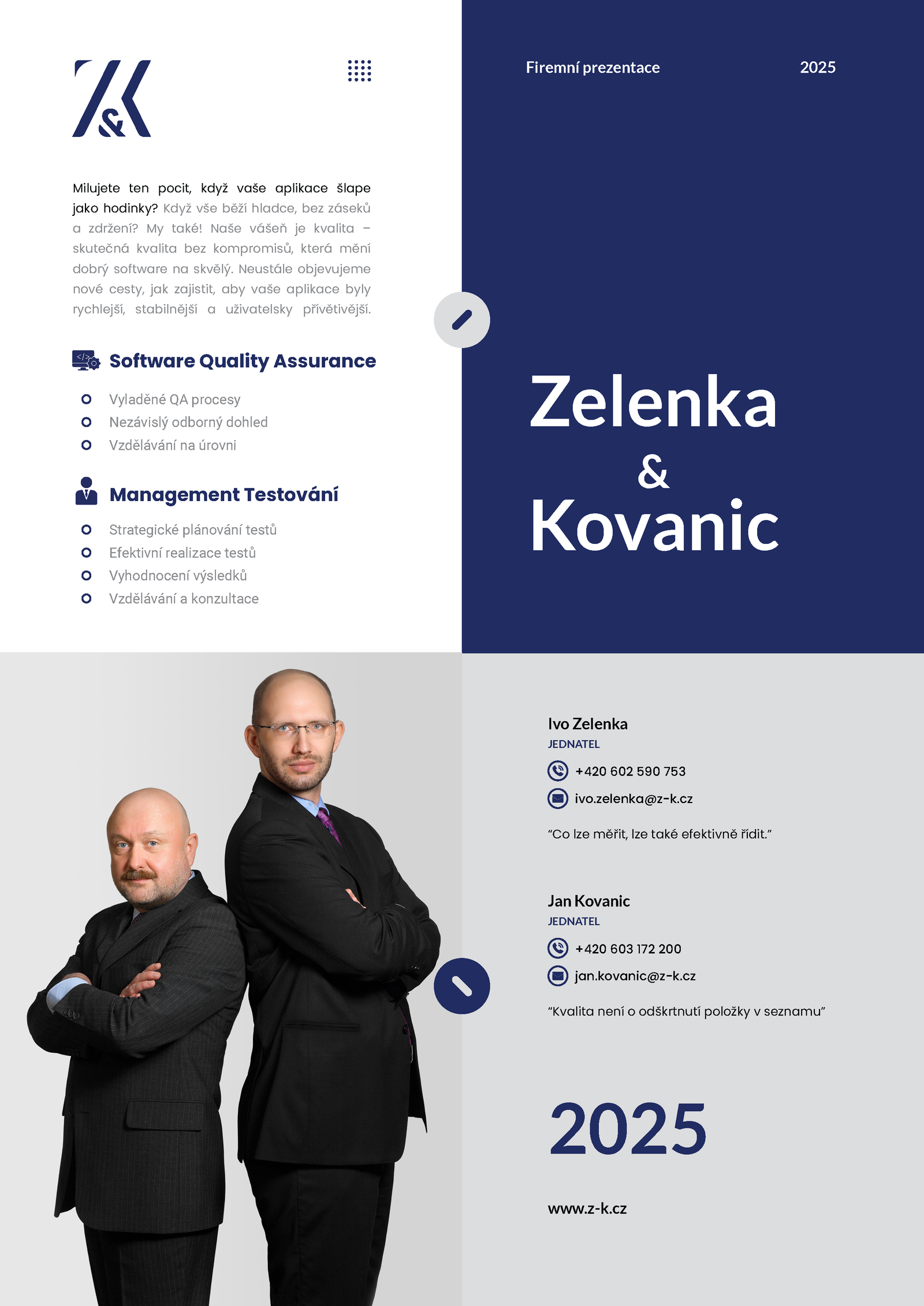
We designed a new logo for Zelenka & Kovanic that reflects the character of their business, combining elegance, trust, and modern simplicity.
The logo is clean, memorable, and designed to work seamlessly across both print and digital materials, supporting a consistent and credible brand presence.
Type: Branding
Société
For Société, we manage the website with a strong focus on SEO and content strategy.
Our work centers primarily on corporate promotional gifts, branded textiles, and paper-based gifts. Through long-term optimization and consistent content development, the website has grown significantly — with organic traffic increasing fivefold since the start of our collaboration.
Type: Organic SEO
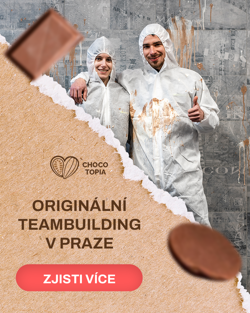
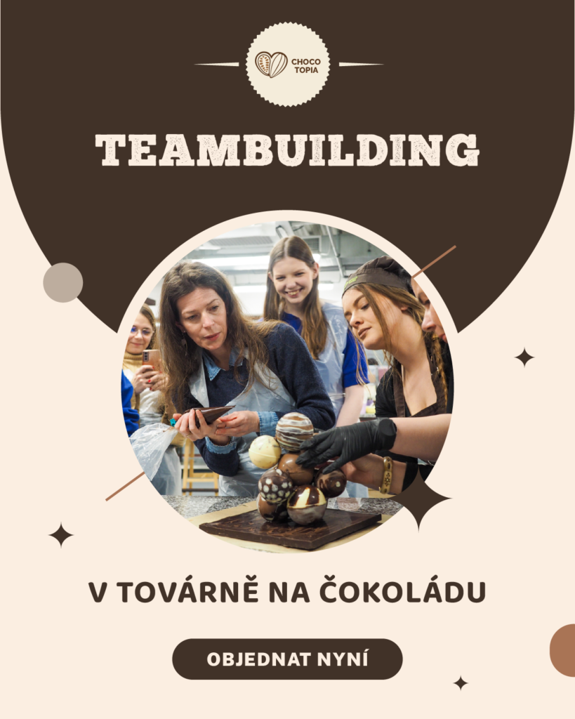
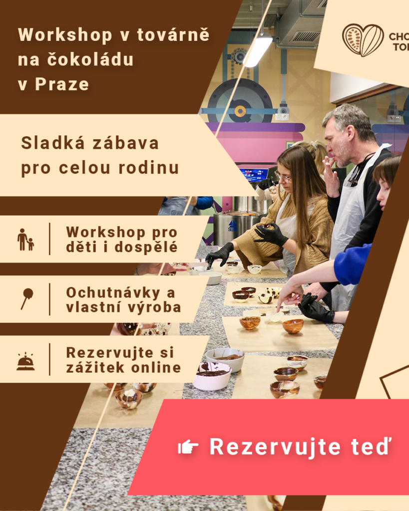
Chocotopia
For Chocotopia, we helped shape how the brand shows up in paid advertising through carefully crafted creatives and campaigns.
We focused on translating the atmosphere of the experience itself (playful, immersive, and a little magical) into ads that feel genuine and inviting. The result is communication that doesn’t feel like advertising, but like an open invitation to step into Chocotopia’s world.
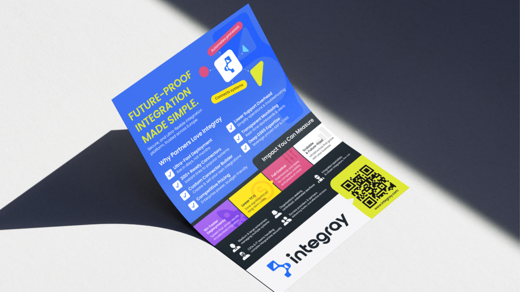
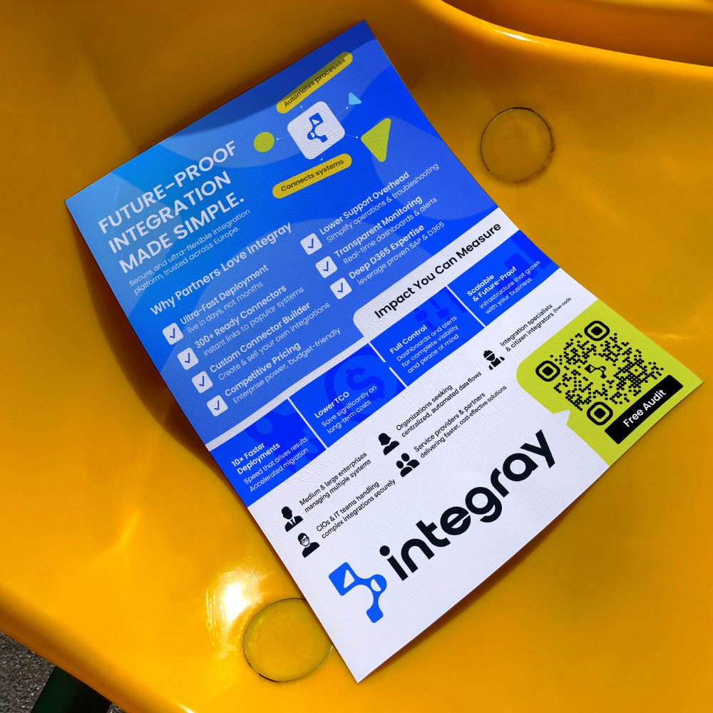
With Intergray, we supported the brand through presentations, printed leaflets, and supporting visual materials.
We helped translate complex information into clear, well-structured, and visually consistent outputs that are easy to understand and pleasant to work with whether in meetings, sales conversations, or printed form.
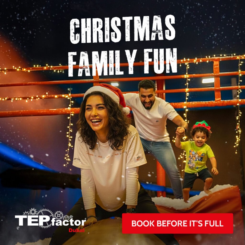
With Tep Faktor, we focus on paid advertising and creative production that captures the real emotion of the experience.
We work closely with the team to understand what excites their audience, adrenaline, teamwork, fun and turn that feeling into campaigns and visuals that feel authentic, dynamic, and drive real bookings, not just clicks.
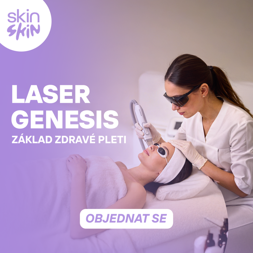
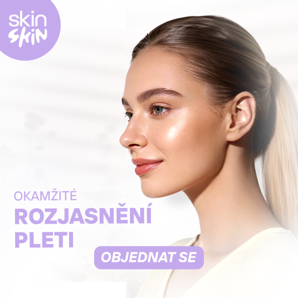
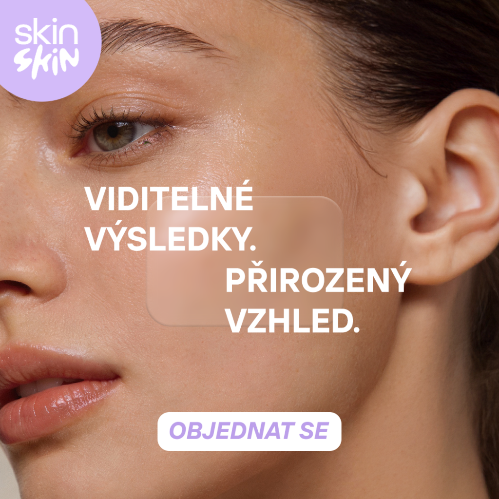
With SkinSkin, we work side by side on paid ads and ad creatives, focusing on what actually resonates with their audience.
We take the time to understand the brand, the product, and the feeling it should create – then translate that into campaigns and visuals that feel natural, authentic, and drive sales without shouting.
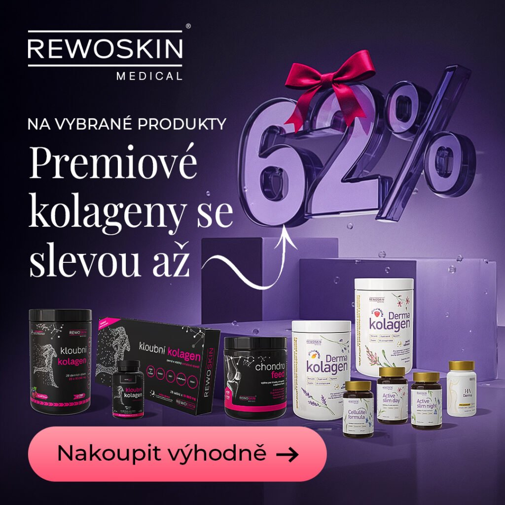
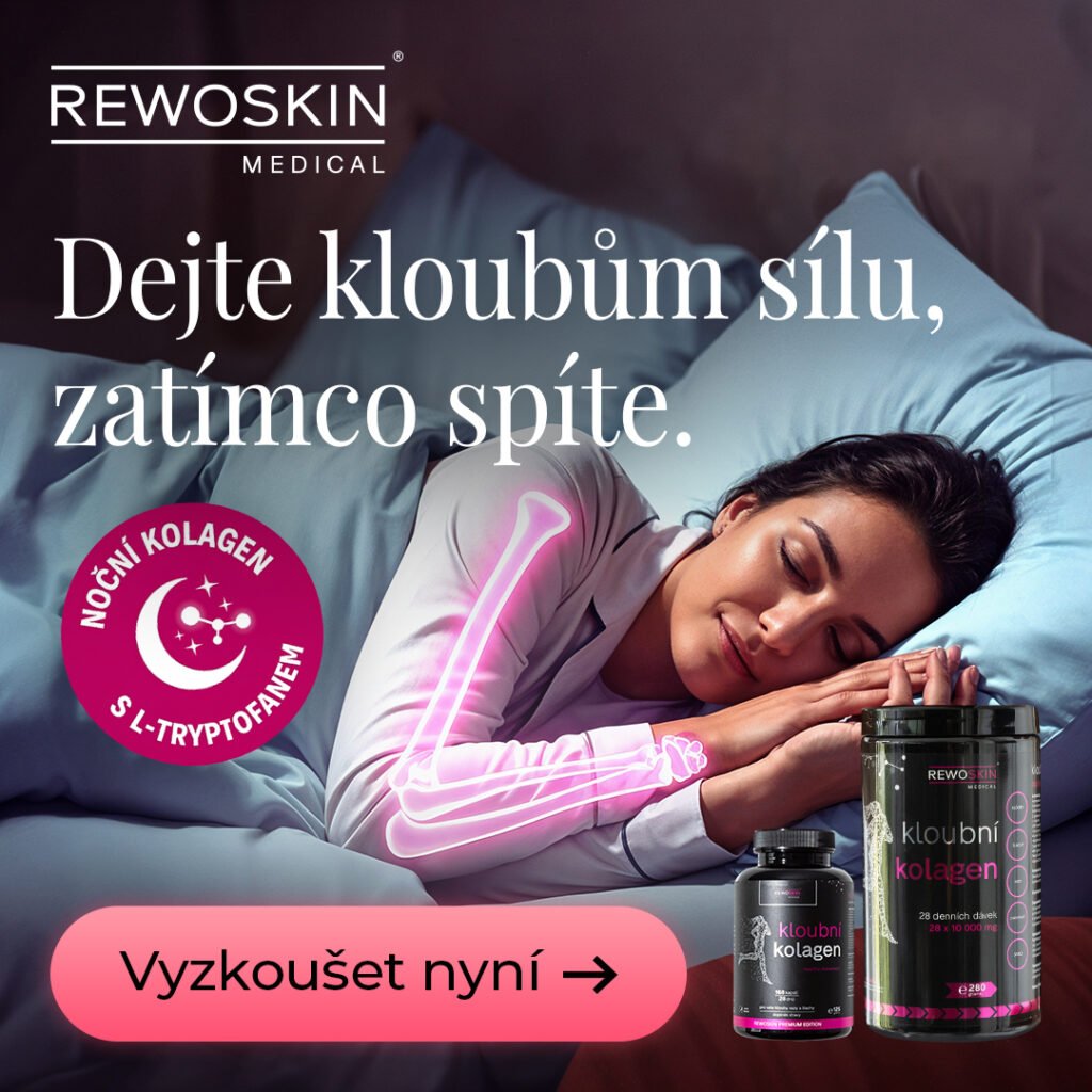
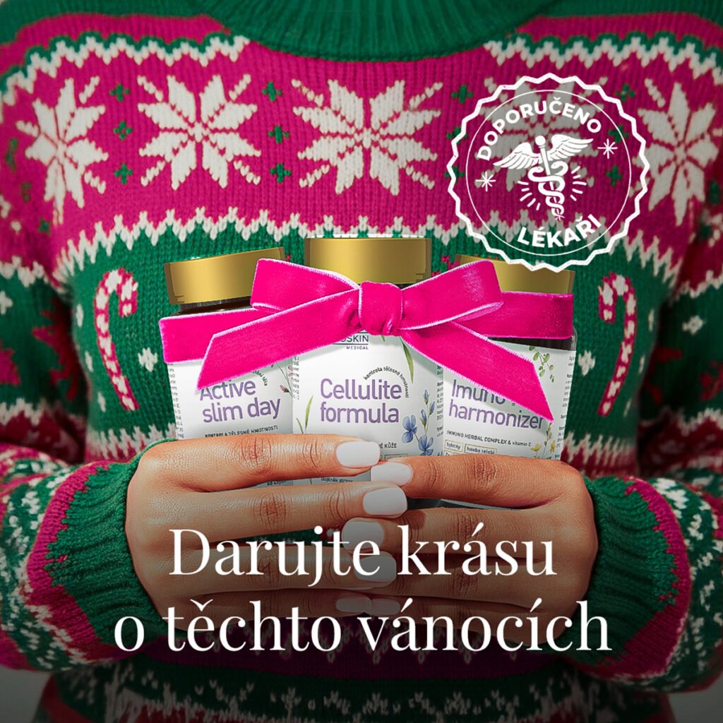
For Rewoskin, we deliver full-funnel performance marketing, combining paid ads with our Performance Design (creative) membership.
We scale results through high-performing Google and Meta campaigns, backed by fast, conversion-focused creatives allowing us to test, optimize, and grow revenue efficiently.
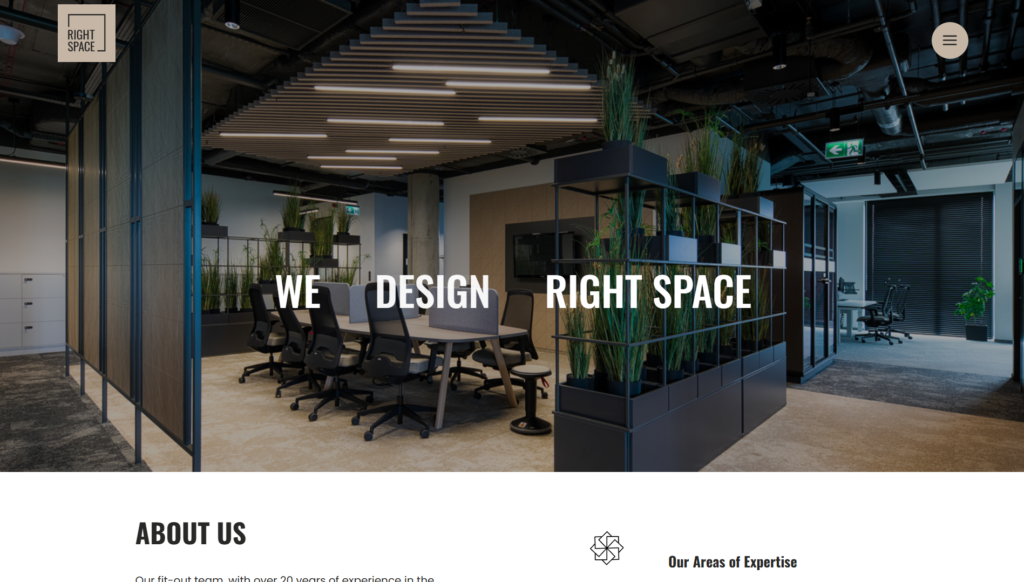
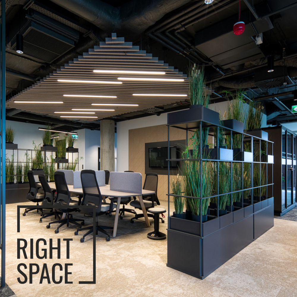
We designed and delivered a website for RightSpace, part of White Star, created for the Czech and Polish markets.
The website is built on a clear structure, modern real-estate–driven visuals, and an intuitive user experience. The goal was to create a consistent and professional digital presence that communicates the flexibility of the workspace offering while strengthening brand credibility across both markets.
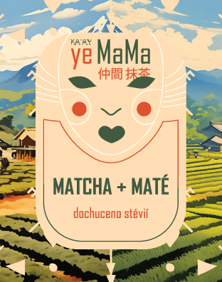
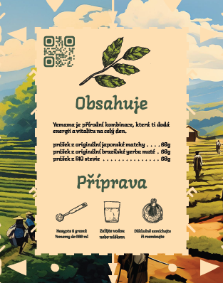
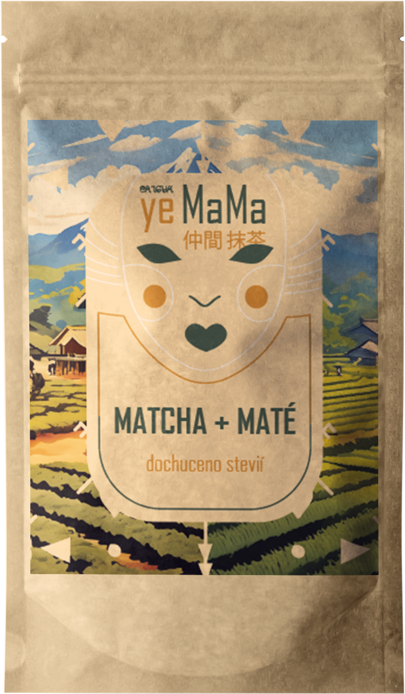
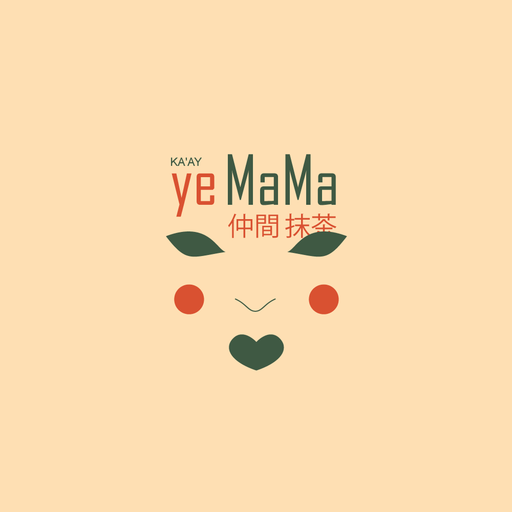
We created the complete brand identity for Yemama, designed the e-commerce website, and helped build the brand from the ground up.
Our goal was to develop a modern, soft, and authentic visual style that highlights the brand’s personality and its focus on carefully curated products for children and parents. The scope included the logo, color palette, typography, graphic elements, and the complete online environment – resulting in a cohesive and distinctive brand presence.